DESCRIPTION
A visual identity designed for a mycology brand, combining bold aesthetics with a modern approach to communicate expertise, innovation, and growth.
Branding | Graphic Design | Brand Strategy
TOOLS
Adobe Illustrator | Adobe Photoshop | Figma
WORK PROCESS
MycoFarming uses fungal biology to break down persistent water pollutants: naturally, scalably and at a lower cost.
Based on this concept, the brand identity was developed to reflect the intersection of science, technology, and the natural environment. The visual system aims to translate complex biotechnological processes into a clear and approachable language, merging organic forms with a more structured, scientific aesthetic.
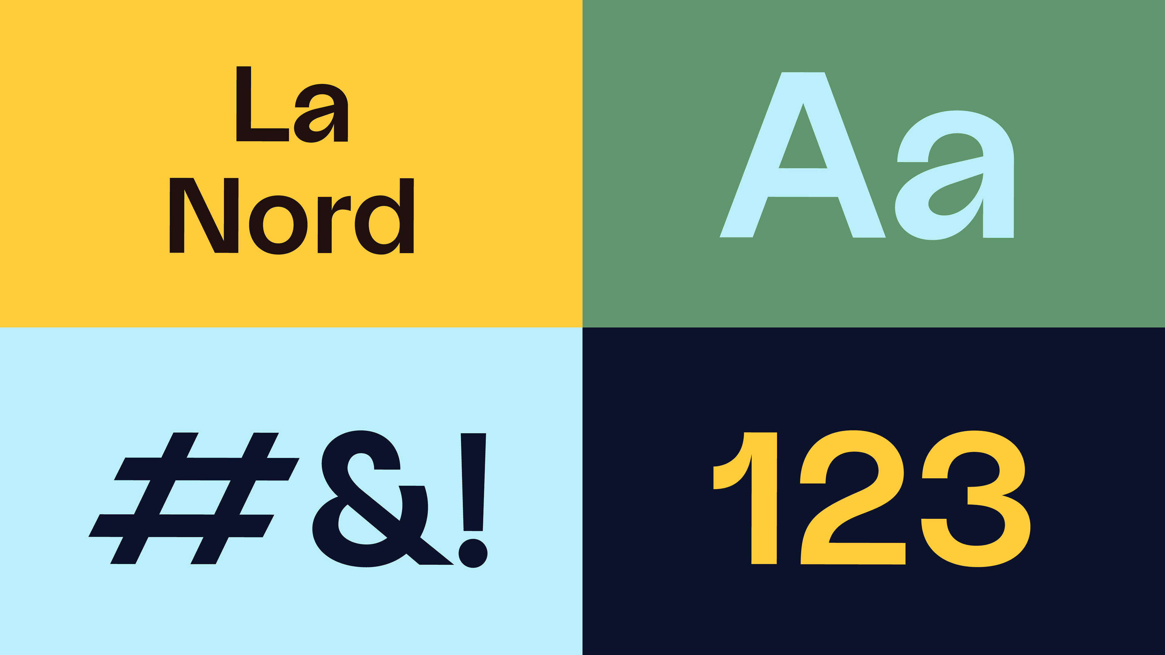
La Nord was selected as the sans serif typeface to reflect the technological context of the project. The font features subtle twists and organic details in each letterform, evoking natural shapes and reinforcing the connection between science, technology, and the natural environment.
The color palette is directly inspired by the natural environment: blue represents water, brown refers to soil, green symbolizes the fungi, and yellow reflects the sunlight required for growth.
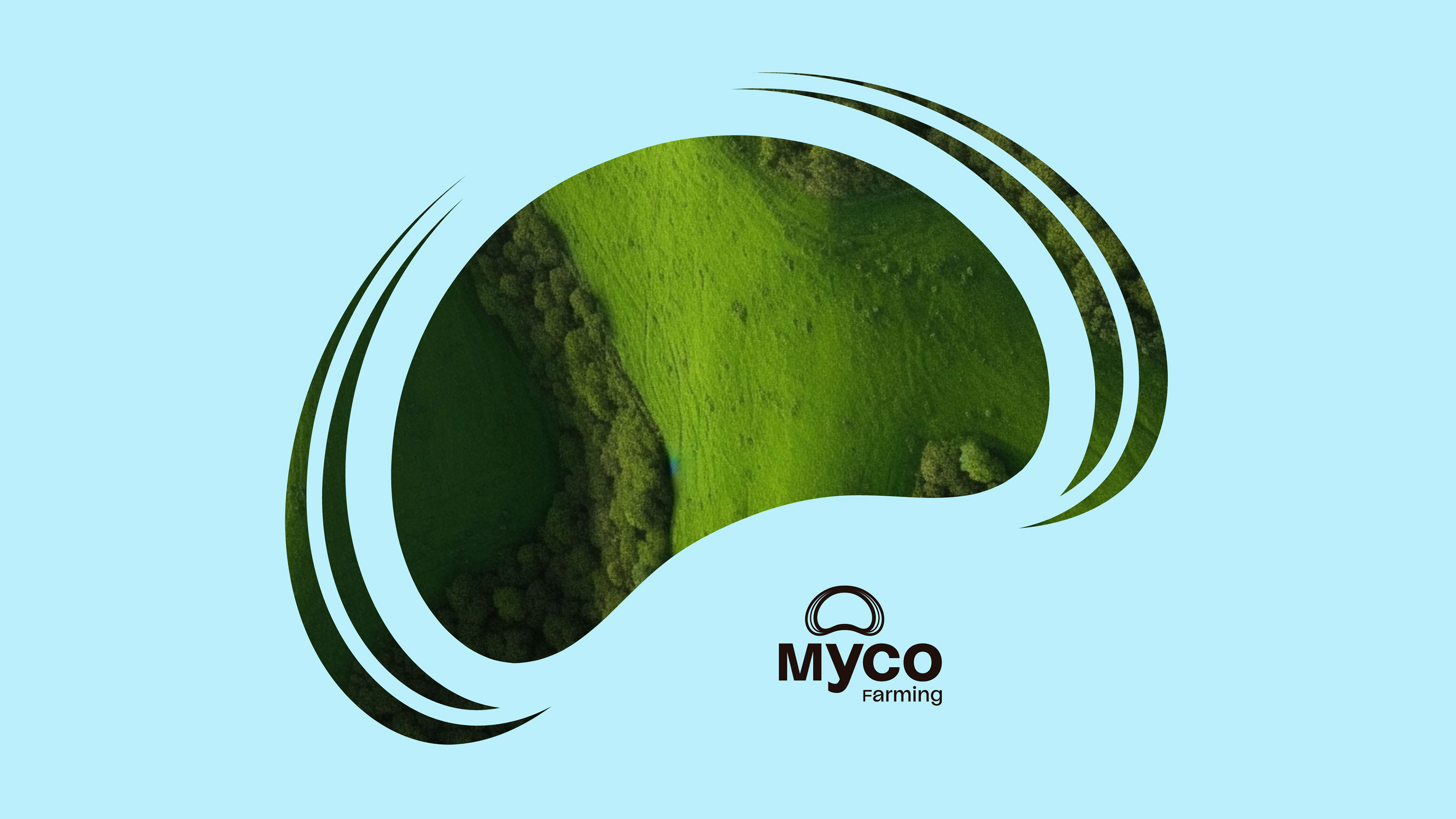
Then we introduced an innovative concept inspired by a breathing fungus, using organic motion and form to reinforce the idea of living, adaptive biological systems.