This case study is a reflection of how I work: understanding the problem deeply, turning research into strategy, and designing with purpose.
THE Problem
Booking a cruise is a high-stakes decision involving significant investment and complex choices. Research revealed an opportunity to make cruise e-commerce clearer, more transparent, and confidence-building from the first interaction.
PROJECT SCOPE
Homepage
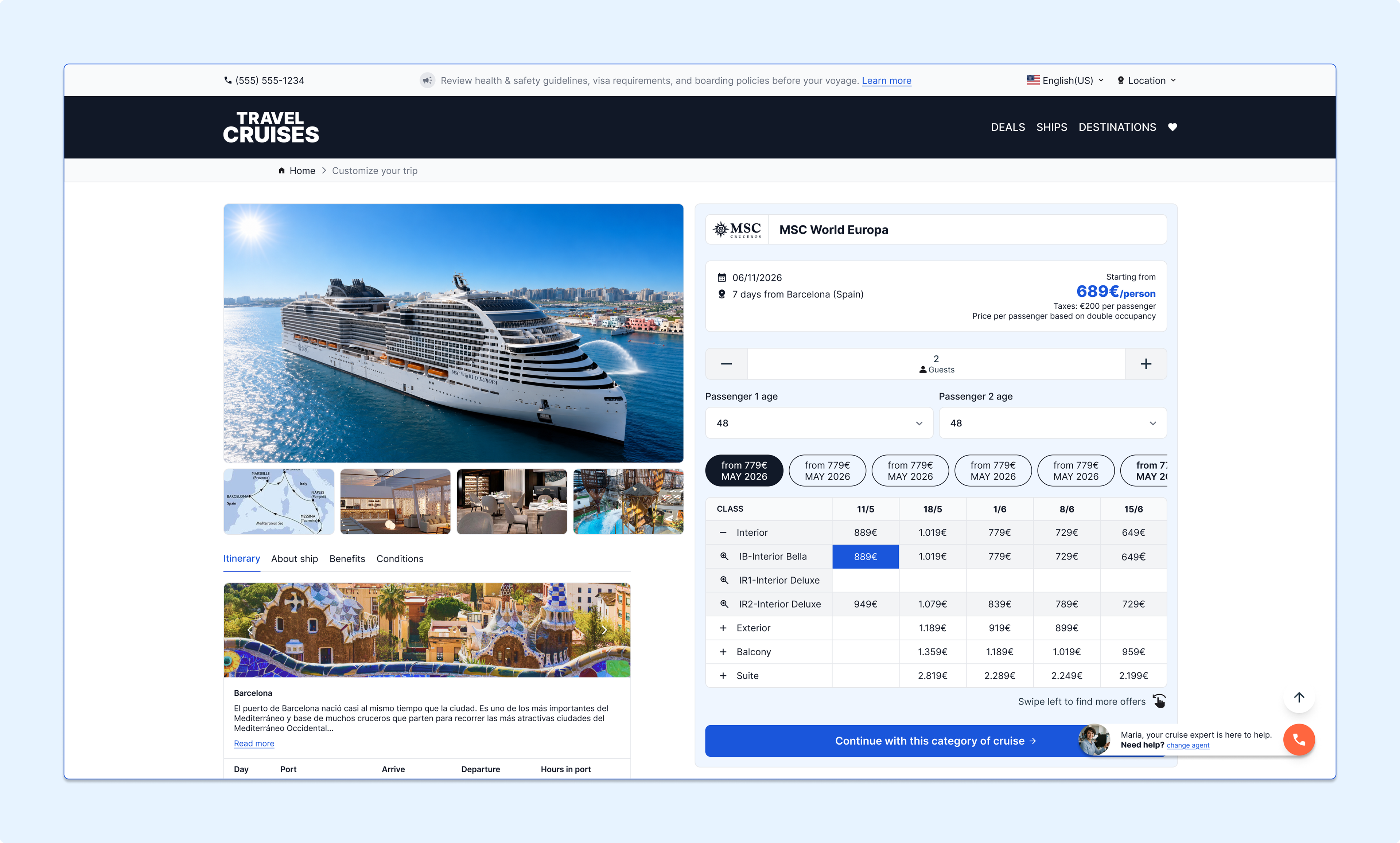
Cruise Overview
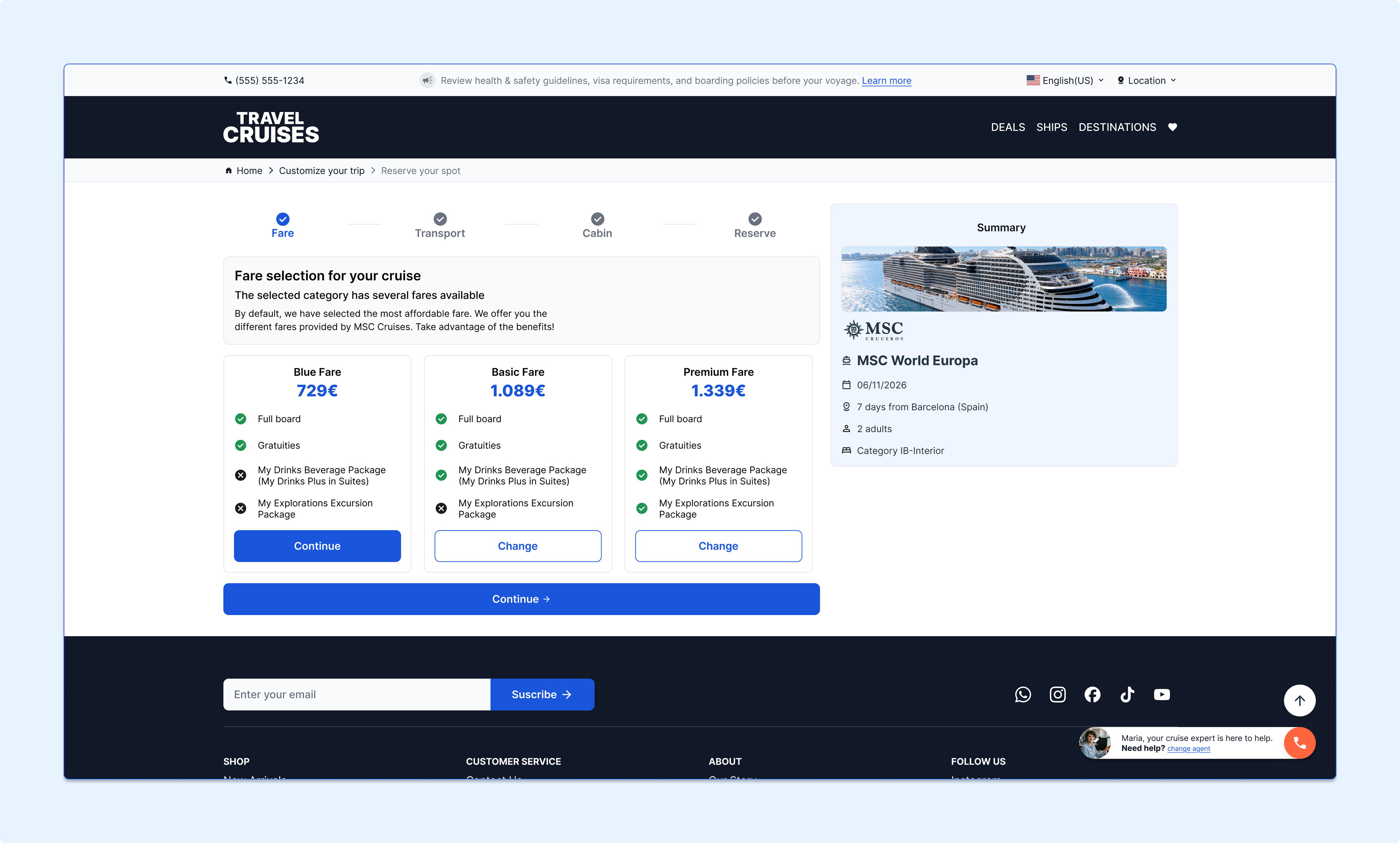
Reservation Stepper
Reservation Summary
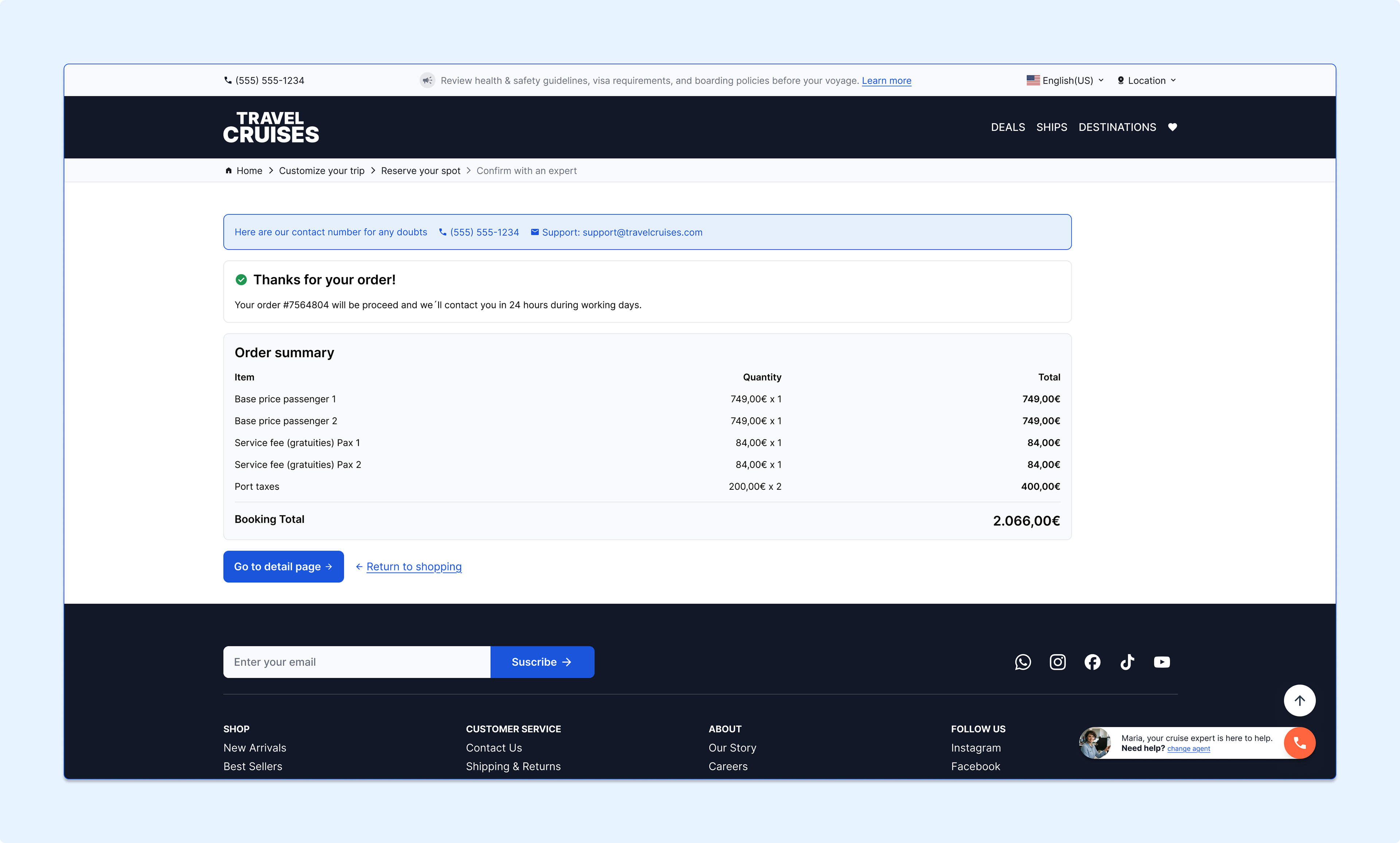
Reservation Confirmation
Cruise Overview
Reservation Stepper
Reservation Summary
Reservation Confirmation
RESEARCH METHODOLOGY
Domain understanding, competitor analysis and user feedback were used to understand how people approach high-consideration cruise bookings.
KEY FINDINGS
- Users struggle to interpret complex information and find it.
- Expert guidance is a key source of confidence.
- Trust is built through transparency and clear communication.
- Users seek reassurance that they are making the right choice—not simply finding the lowest price
- Expert guidance is a key source of confidence.
- Trust is built through transparency and clear communication.
- Users seek reassurance that they are making the right choice—not simply finding the lowest price
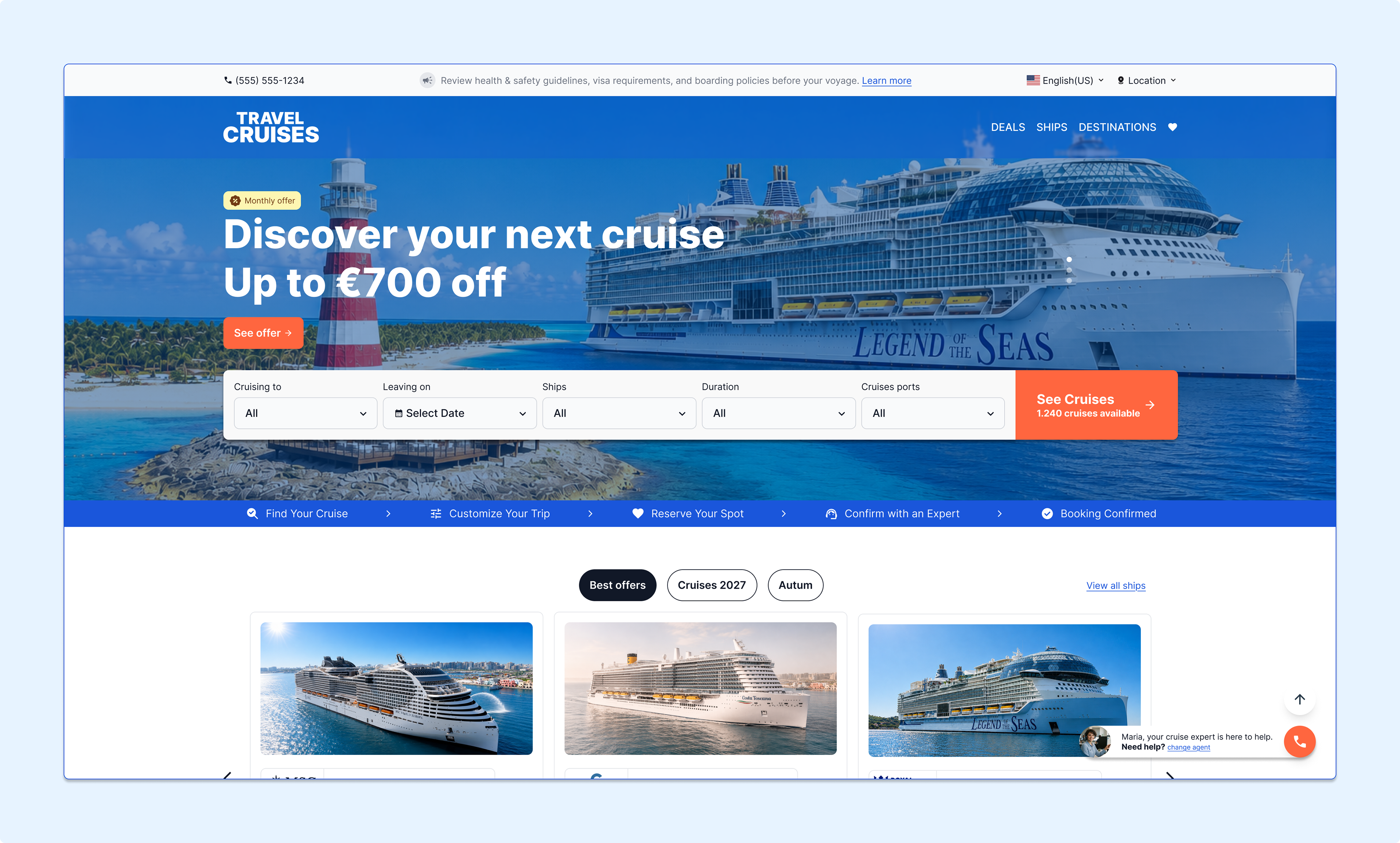
Approach & Solution
A clear, confidence-building booking journey combining familiar search patterns, simplified information hierarchy, transparent pricing, trust signals and accessible expert guidance.
design & Development
Designed in Figma. Built with Tailwind CSS.
I would strongly recommend a reusable component system, and variants create consistency between design and implementation. The cruise identity is layered onto familiar UI patterns, creating a distinctive experience without sacrificing usability or increasing cognitive load.